
Designer
Lauren Liess's debut, The Hideaway, in the
DC Design House is a huge success! Texture, warmth and unique and interesting accessories create the perfect place to relax, and yes, hideaway. Here is Lauren seated in her own chair design, the Mad Hatter, with curtains in Happikat by Lauren Liess Textiles.
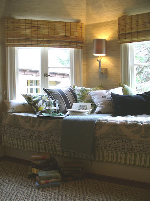
The focal point of the room is an expansive Princess & The Pea stacked mattress window seat. Piles of books and a tea set make you feel like you've stepped into a real room, not just a show house space.

Fabrics in the window seat include Lauren Liess Textiles and Peter Dunham. The floral on the back of the Mad Hatter chairs is by Jasper Michael Smith.


Lauren collaborated with local lighting artist
Rick Singleton who designed and created this amazing floor lamp.

The quality of the details and finish is outstanding and it's a perfect, custom piece for this room.


Artist
Matthew Moore painted a stunning grisaille boxwood garden that beautifully commands the space behind the concrete Parsons desk with an inspirational view. I love how Lauren placed the desk off-center from the painting. Antique chair from John Rosselli Antiques.
Paint colors: Churlish Green, Dimity Grasscloth by Seabrook

Designer
Iantha Carley's masterfully executes strong color in an elegant and refined way in her Master Bedroom and Dressing Room. David Hick's geometric print in green starts off this fresh and crisp palette that includes florals fabrics as well.


Who wouldn't be thrilled to get up each morning to this amazing dressing room wrapped in this happy, colorful Nina Campbell wallpaper. The mirrored Parsons Table is a custom design by Iantha.

The perfect print for this space from artist Anne Harwell of
Annechovie.

Attention to detail is everywhere including these AMAZING light switches from Forbes and Lomax. I covet these!
Paint colors: Charleson Gray, Stron White, Dragged Wallpaper, Nina Campbell wallpaper

The view from the master bedroom to the Master Bath by Allie Mann of
Case Design/Remodeling. Allie did a beautiful job creating a seamless flow between the two rooms. Love the way she hung these three prints.

Paint colors: Cornforth White, Strong White
 David Mitchell's
 One for the Guys bedroom is another standout. A mix of traditional and industrial pieces of varying finishes create a comfortable, hip atmosphere. Eight foot ceilings are elevated with David's choice to paint both the walls and ceiling in Farrow & Ball's Pavilion Gray.

Vintage prints of birds wrap around the space and add dimension in a room with simple architectural details. The shot I'm missing is the far window wall where a large, rustic table and industrial piece create an area for writing.

A practical, narrow bench paired with sneakers in the perfect range of colors for this room!
The
DC Design House, benefiting Children's National Medical Center, opens tomorrow and runs through May 8th. Even though I've posted a lot of images this week - there is so much more to see!
Next week - images from the Exterior and Gardens.
 My lovely friend Anne, a lifelong follower of the royal family, hosted the most wonderful wedding party this morning. Gathering at 5 am, we enjoyed a breakfast of scones, tea, strawberries and a bit of champagne, as we watched together. Anne's friend, whose husband recently returned from London, brought back charming wedding commemoratives. Pictured here though, is a Claudia Pearson tea towel. Absolutely love this all in blue!
 Beautiful flowers...
 Anne's exquisitely monogrammed linen...
 lovely tea cups...
 a just-installed Julie Neill Beatrice 2 chandelier, reminiscent of a crown and...
 a lifelong collection of books on Princess Diana created the most wonderful atmosphere for our memorable time together. Thank you Anne!
 p.s. Wasn't her wedding dress simply perfect!


